

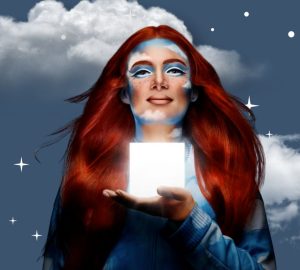


It was announced last month that 2016’s Pantone color of the year was not only one color, but a blending of two: Rose Quartz, a baby pink color, and Serenity, a soft blue hue. The two colors suggest a much needed calm in the midst of our societal storm. In a statement by Pantone referencing the choice for a blur of two colors, they refer to this year being “a gender blur as it relates to fashion.”
If this is your first time hearing about the Pantone color of the year, then know these colors aren’t just for paint chips. They influence the fashion world as well. With retail stores gearing up for spring collection releases, you will definitely be seeing splashes of this color combination styled on mannequins and lookbooks everywhere. Sephora even collaborated with Pantone to create a collection featuring the namesake colors as individual lipsticks and lip glosses. A 24-color eyeshadow palette also included this year’s colors with a plethora of complimentary colors to mix them with.
When asked about her thoughts SCAD alumni Jireh Maddox said, “It makes sense. Pantone forecasts colors based on how they believe the upcoming year will be. Bad things happen in previous year? Let’s make happy colors for the next year.” According to Pantone, she isn’t far off. A quote from their website states that the blending of Serenity and Rose Quartz is“…A symbolic color selection; a color snapshot of what we see taking place in our culture that serves as an expression of a mood and an attitude.”
Fellow SCAD Student Media and MFA Motion Media Design student Britt Lyle stated,“It makes me feel like I want to do a Sailor Moon/Steven Universe cosplay,” referencing characters of the popular cartoons, Rose Quartz and Queen Serenity, that share the same name.
If you’re looking to revamp your wardrobe in 2016, keep a lookout for these baby soft hues and integrate a little calm into your closet.

