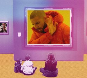
Hailing from Latvia, 4th-year BFA Illustration student Ernests Brants is looking to work in editorial and advertising illustration with his unique and distinct art style inspired by 1930’s rubber hose and “weird street art,” which has netted him awards from American Illustration. In regards to his style, Atlanta-native Brants works digitally after making the switch from predominantly creating pen and ink illustrations. “[I create] mostly in black and white, mostly cause I’m colorblind, a little cause I’m lazy and hope to juxtapose cute or friendly characters/scenes with darker themes. I love to cram as much detail as possible into my work, as most of it is just a collection of doodles that got out of hand,” he says.
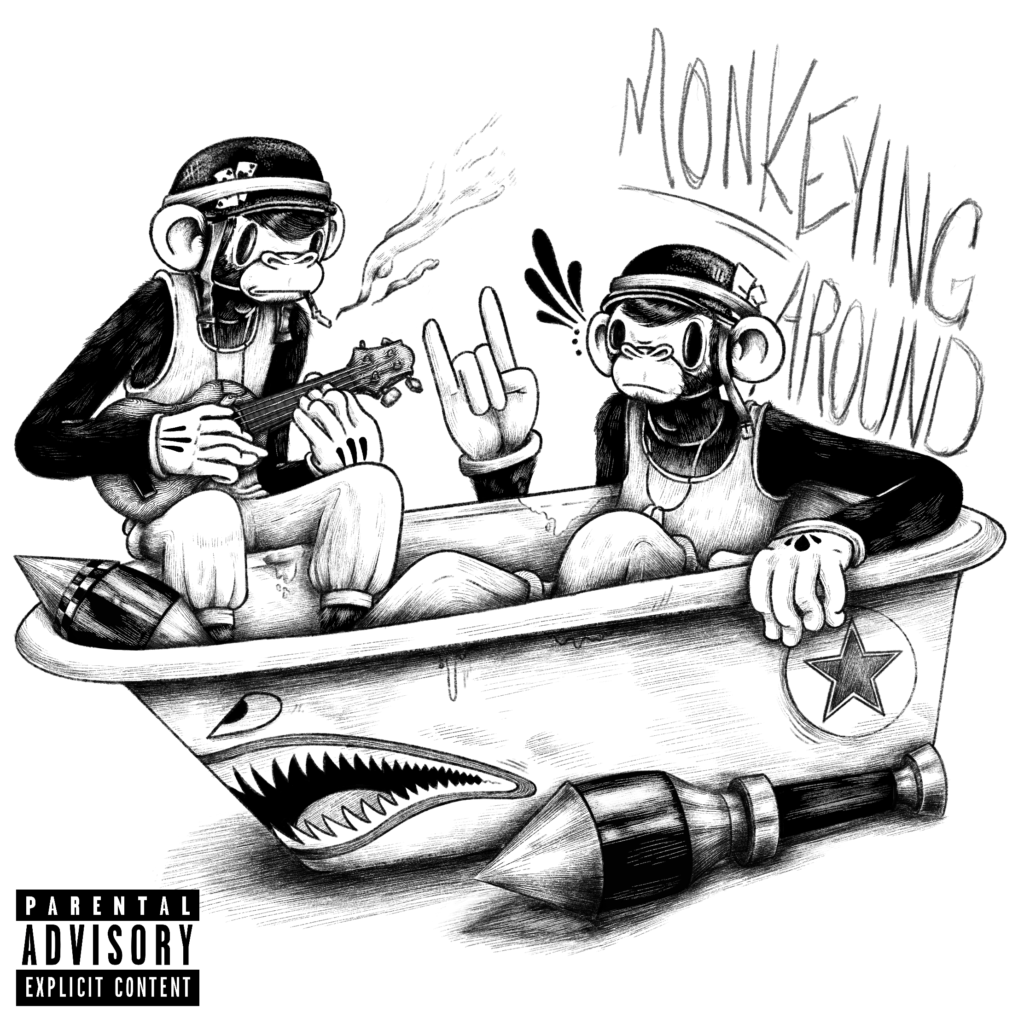
Intended to be an album cover, Brants created this piece featuring two monkeys sitting in a tub to experiment and play around with character and prop design. Speaking about the piece, Brants has said that it represents the inner machinations of his brain.
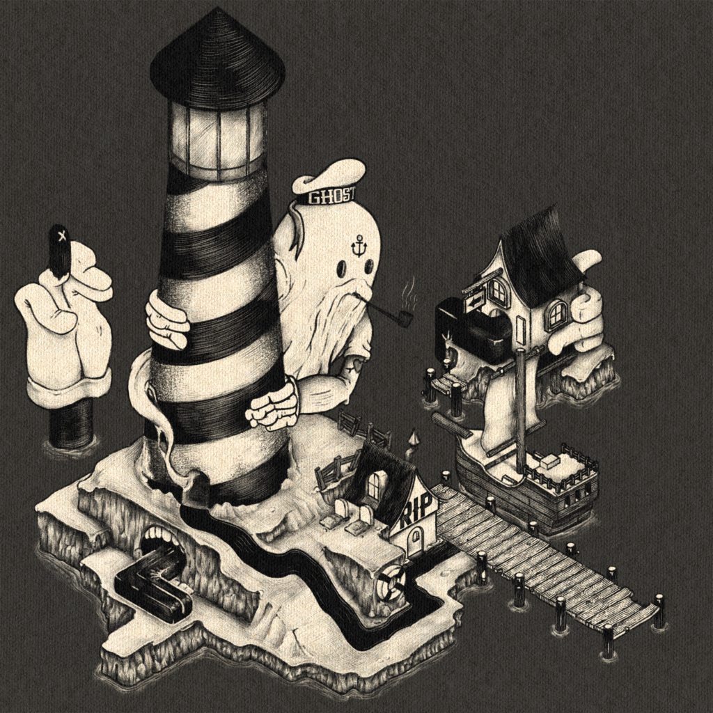
Brants is fond of creating isometric illustrations and this one was not an exception. “It’s another isometric piece that took me forever to do,” Brants mentioned regarding the piece, which was a personal project that he worked on and off on. He particularly enjoyed playing with the nautical elements and designing the ghost pirate sailor, noting that this was his first time drawing a decent-looking pirate ship.

An advertising illustration meant for a skateboard deck, Brants created this piece to play with the juxtaposition of a calmer environment and a creepy or weird character who was submerged in water as Brants wanted to get some practice in drawing the element.
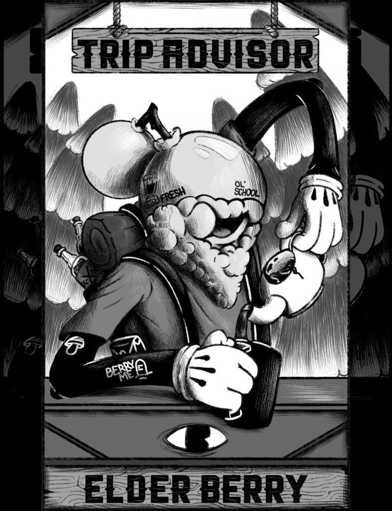
Meant to be part of a full board game design, “Elder Berry” is the one and only character of the story of Brants’ imaginative board game. Brants noted that this piece was an excuse to put as many puns in a drawing as possible.
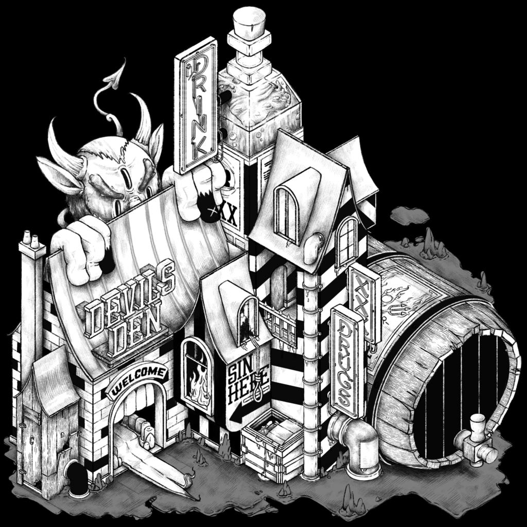
In another isometric piece, Brants aims to explore the question, “Where would the devil hang out?” To this, his answer was, “said place would be warm.” Resembling an old-timey pub or saloon, Brants uses this work to explore making regular items like the bottle massive and incorporating them into a landscape.
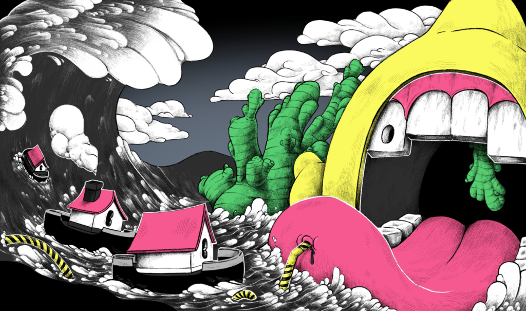
An avid drinker of lemon and ginger tea, Brants wanted to create a drawing of how he felt whenever he drank insanely strong ginger tea. This piece was meant to be a packaging design for said tea in hopes that it would be an accurate representation for others as well.
Many would think that having a reduced ability to perceive colors correctly would make it difficult to create amazing work as an artist as color can often be crucial to good illustration, but Brants’ next-level artwork reminds us that a lack thereof can be just as powerful.
To check out more of Brants’ showstopping art, you can check out his Instagram @intoxicate.ted


