Vintage style, not values: the art of Elizabeth Efferson
By Cait Jayme and Elizabeth Efferson
As time goes on, the way we create art and what it ends up looking like changes with our culture and society. Especially here at SCAD which constantly keeps up with the most modern aesthetics and latest technology, it can be a breath of fresh air when we see things that are inspired by a vintage perspective, which is exactly how I felt when I first viewed Elizabeth Efferson’s fantastic vintage-inspired artwork. Efferson is a 2nd-year painting major with a minor in concept art for games that works in a variety of different mediums including digital art. Scroll to learn more about her work and visual inspiration from Efferson herself!
What are your historical inspirations?
For about half my work, I use reference photos from the 1930s-1950s, and the other half is from the late Victorian/Early Edwardian period (about 1890 to 1915). These two periods of women’s style have some of the most striking silhouettes in my opinion.
Aside from my love of the hair and fashion of the time, using antique photos as references is very convenient as any photos created and published before the year 1923 are currently in the public domain!
I’ve worked in costume construction for theatre since I was a teenager and that got me interested in how all the layers involved in ridiculous old evening gowns fit together. I love how the styles evolved a little bit at a time in the early to mid 20th century.
In my fascination with vintage style, I stay almost exclusively to womenswear because frankly, the past few hundred years of men’s clothing simply has no flavor.
Highlight pieces from Efferson’s work
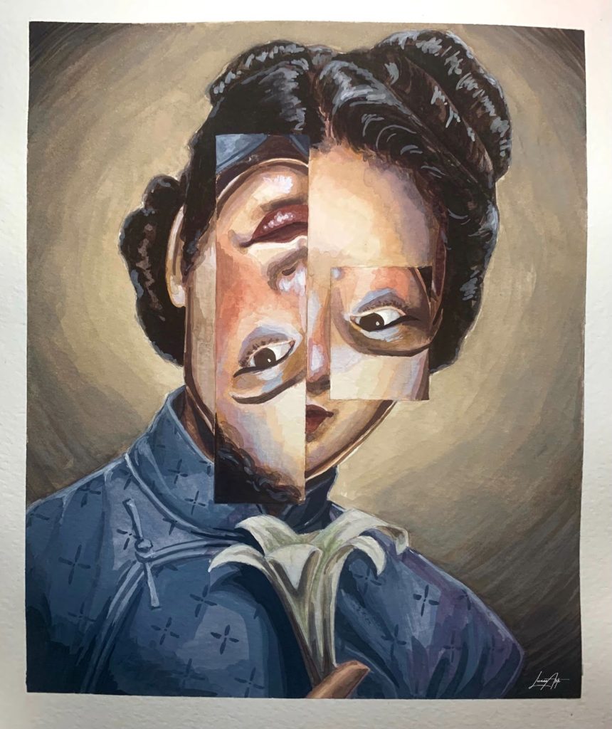
This piece is a perfect example of my 1940s pieces. This one was done for class in the Fall quarter of 2021 in gouache and was part of a Halloween series! This piece gives me a chance to talk about one aspect of using very old photographs as reference, they’re all in black and white! I used to see this as a downside since I couldn’t see the full range of a person’s skin tone and clothing colors in a greyscale photo, but recently I’ve started seeing it as a challenge to make up a color palette from my imagination. As you can see in this piece, I tried to incorporate more than just neutral colors in her skin by using a lot of purples, blues, and oranges.
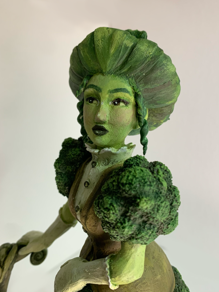
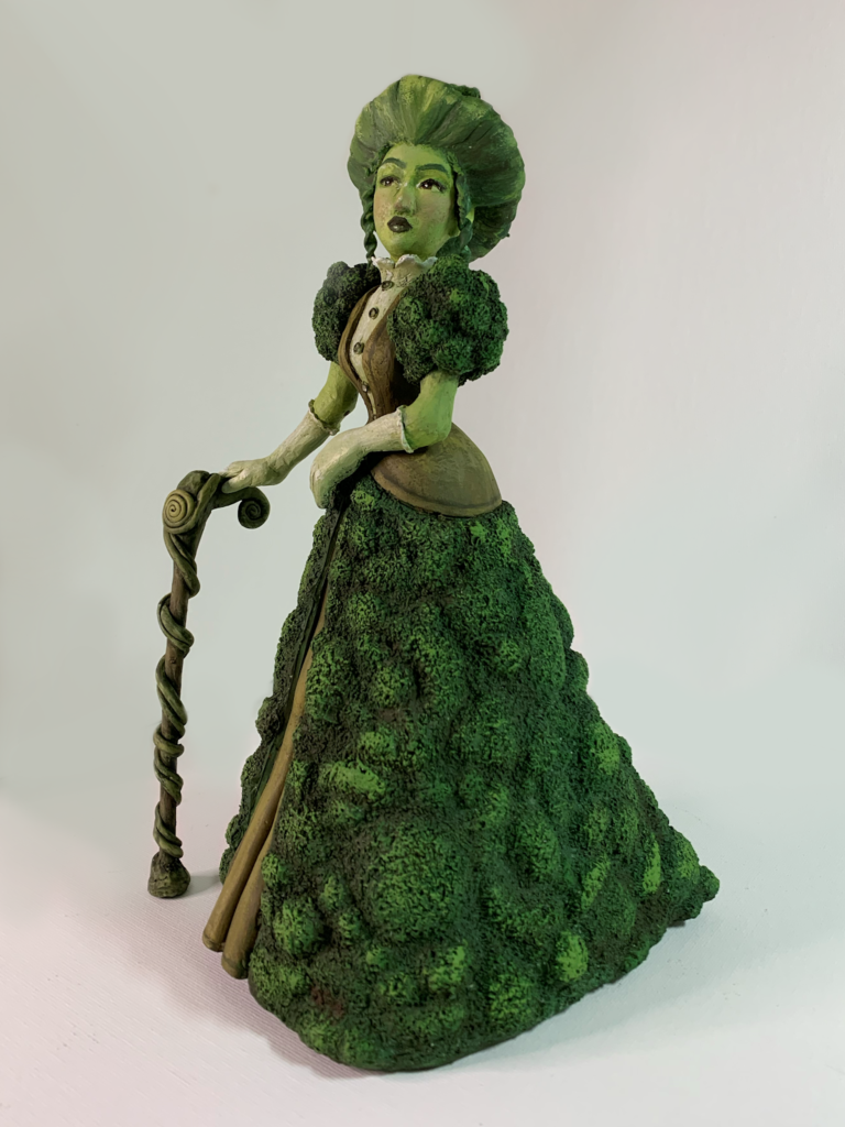
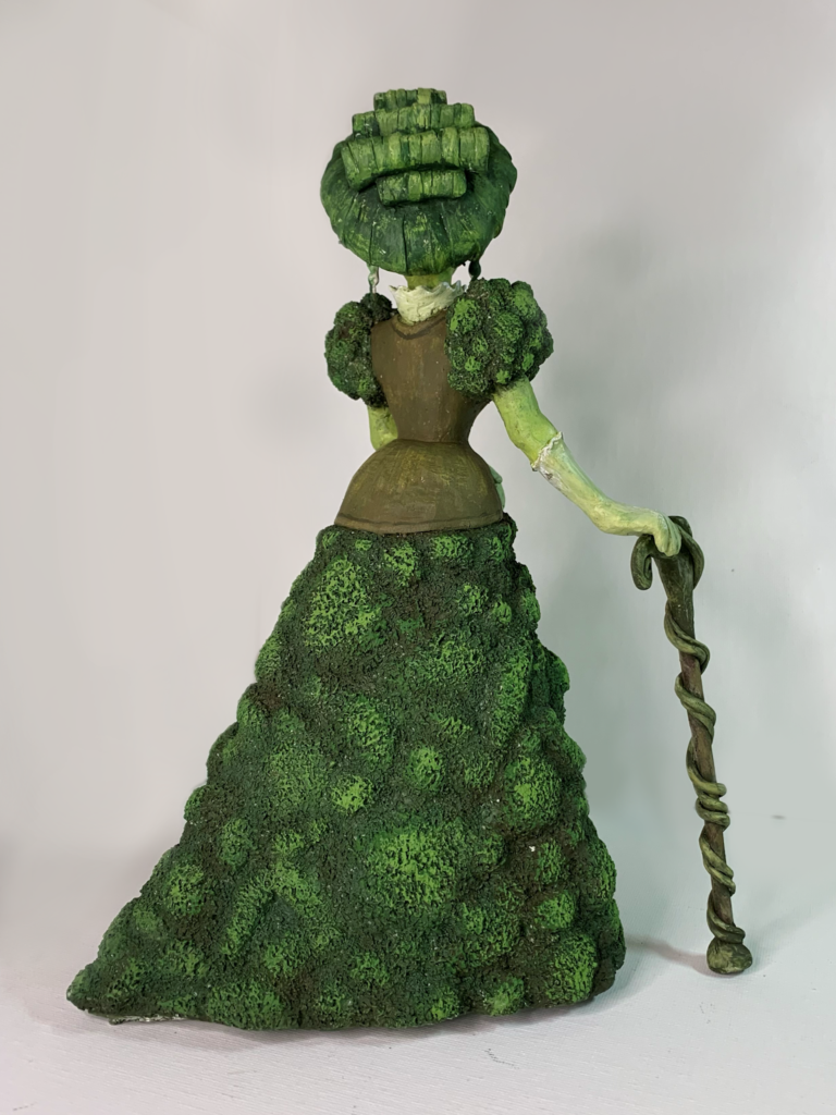
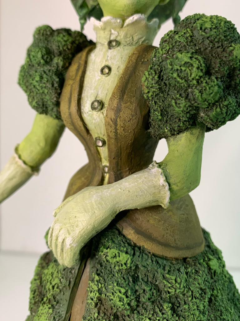
This sculpture was also done for class last year and was inspired by the silhouette of victorian walking suits! This is made of polymer clay and I’m sure many students will remember this 3D design project. I named this character Evergreen and she was a nature goddess made out of moss. She’s just over 10 inches tall and now lives on display in my mother’s dining room. I had never tried working in 3D until this project, but recently I have been incorporating sculpture into much more of my painting work.
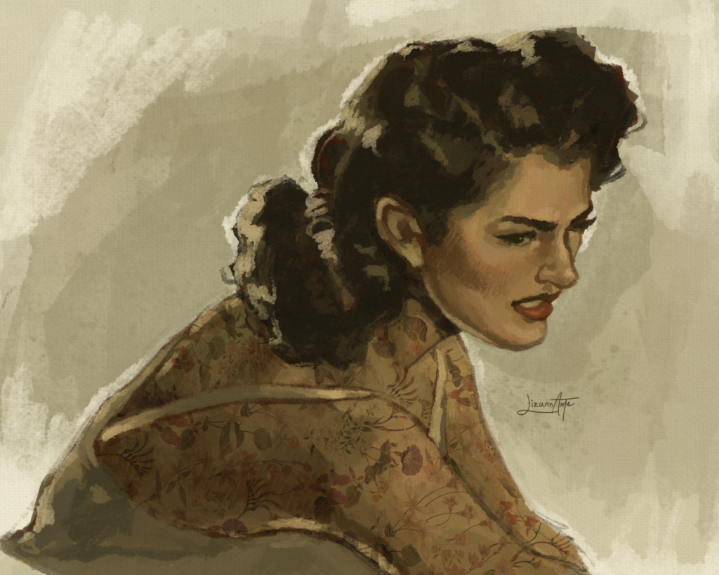
Another 40s piece! I wanted to discuss this work because it is a study and doing studies is one of the fastest ways to learn new painting techniques in my experience. This is a digital study of a painting by well-known American illustrator Andrew Loomis, one of my favorite artists next to John Singer Sargent and J.C. Leyendecker. This piece isn’t a perfect copy as I changed up most of the colors and gave her a bunch of tattoos just for fun. I thought the expression on the original was stunning and I wanted to challenge myself to try an expression other than a pleasant smile, which I find myself falling into a habit of painting.
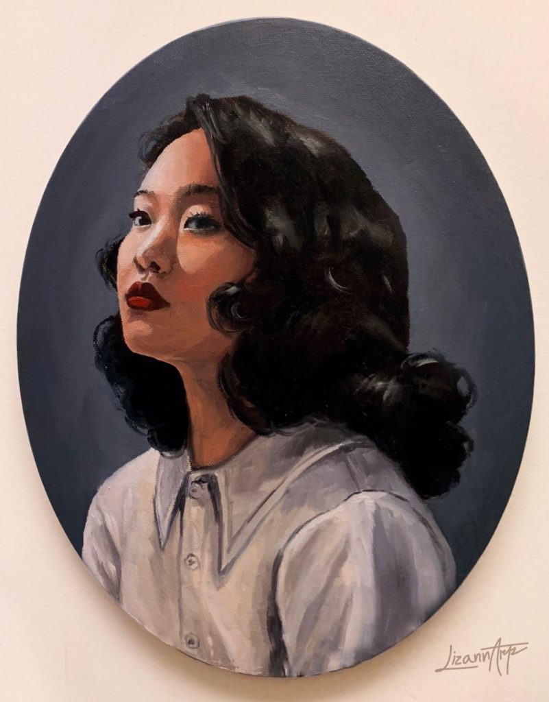
The final work I want to show is one of my oil paintings. This piece is a portrait of a good friend of mine who enjoys vintage hairstyles as much as I do. The shapes created by brush-out hairstyles are so fun to paint and exaggerate for more dynamic compositions!
Thanks for sharing! Where can we find your work online?
My art account Instagram is @lizannarts where I share almost all of my work. I am always open to commissions!


