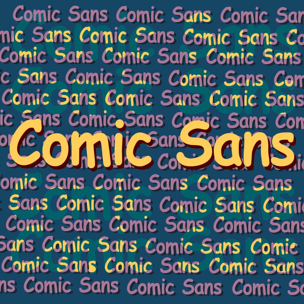
Ah, Comic Sans. Supposedly the most hated font in existence. Graphic designers and other people with eyeballs alike had rejoiced when they thought this cartoonish font had backspaced itself out of human’s collective consciousness, only to shield their eyes in horror when “boom!”– it made a comeback, claiming several headlines in the news.
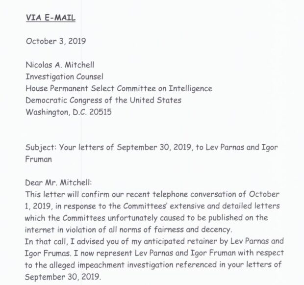
The person responsible for this comeback is John Dowd, former lawyer of President Trump and current lawyer of Rudy Giuliani’s several associates, who are investigated as part of the Ukraine scandal. On Oct. 3, representing Lev Parnas and Igor Fruman, Dowd sent a letter to the U.S. House of Representative’s Intelligence Committee. The internet was soon in uproar, not because of the content of the letter, but because that the entire letter – this very grammatically correct, professionally written, seriously argued letter – was typed in Comic Sans.
Kyle Cheney 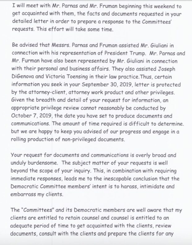
Kyle Cheney 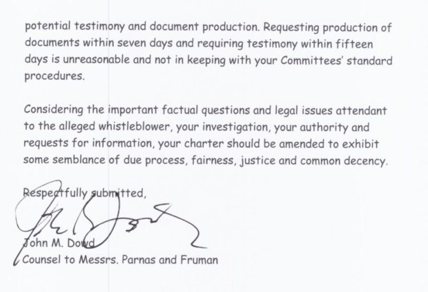
Kyle Cheney
Now, I laughed when I saw this. Surely this was fake news? What a brilliant joke it would be if the most ridiculed font in the history of fonts was used to defend two seedy characters. It was hard to say which is more divisive: the Ukraine scandal and the impeachment, or the font Comic Sans.
In the design community alone, Comic Sans has always been the butt of the joke. “The worst font in the world,” one of my classmates muttered under her breath, sullen-faced, when I brought up the subject in my graphic design class. The reasons for the hatred is admittedly plenty: being cartoonish, it looks dislocated and disproportionate, two qualities that could send graphic designers into instant cardiac arrests. With uneven spacing, varied shapes, and thick crooked strokes, the font is usually saved for childish, ridiculous purposes, and even then its mere sight is enough to induce a derisive scoff from any adult in the room.
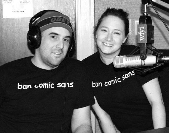
The hatred is so vehement that, in 1999, graphic designers Holly and David Combs created a movement called “Ban Comic Sans.” In their manifesto, the couple cried: “We call upon the common man to rise up in revolt against this evil of typographical ignorance. […] It shall be salvation to all who are literate.”
Understandably, the movement gets much ridicule (though nowhere as much as Comic Sans). But the extremity of the Combs’ loathing makes us, the amused bystanders, look within ourselves and ask “Is there much of a point to hating Comic Sans?”
As Vincent Connare, creator of the infamous font, said, “I you love Comic Sans you don’t know much about typography. And you if hate Comic Sans you need a new hobby.”
Melissa Kuperminc, professor of graphic design at SCAD, shared her thoughts about the font, “Like many designers, I’m not a fan of Comic Sans, but I think it has its place. It’s easier for us designers to get snotty about these things, but I do believe it can be used well in some settings.” She gave an example, “When my husband sends students out to do surveys, they use Comic Sans to make it friendly.”
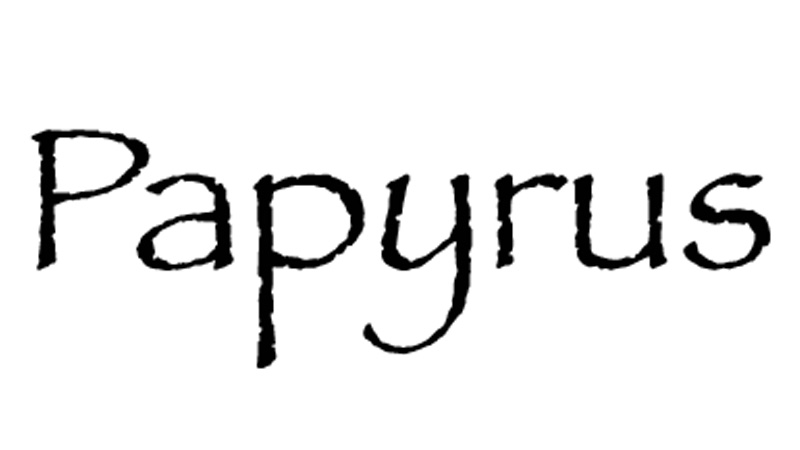
“Anyway, it’s nowhere as horrible as Papyrus,” she added.
Comic Sans has also found a place as a reading aid for people with dyslexia. Though it has been debated whether typeface design really makes a difference in reading time, the British Dyslexia Association nevertheless recommends Comic Sans for easier reading.
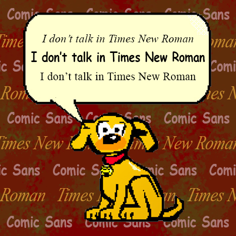
“I wouldn’t use it in a lot of my work, but it’s calm, bubbly, and easy to read,” said Chloe Chen, a second-year graphic design student. Because the font is bubbly and easy to read, it appeals to children (it certainly did appeal to be when I was a child!). Its conception suggested just as much: when Connare was designing a speech bubble for a yellow cartoon dog, it occurred to him: “Dogs don’t talk in Times New Roman!” Then, taking references from graphic novels and comic books, Connare created Comic Sans, blissfully unaware of how his creation would change the world and shape the tides of Twitter, all so that the yellow cartoon dog would have a font to talk in.
As it turns out, it wasn’t just Connare’s yellow dog that found its voice in the typeface. Lawyers, too, can talk in Comic Sans. Whatever you think of John Dowd, Giuliani, or Donald Trump, you have to admit that a letter to the House written in Comic Sans is pretty funny. It is just so passive aggressive to use such a derided font for such formal language, to sign off “Respectfully submitted” in such complete contempt. The Trump side of the scandal could not hope for a letter that better shows their scorn and disdain for the impeachment inquiry. I’m sure if someone had briefed the President on this, he would have tweeted out in support of Dowd, Comic Sans, and maybe even Vincent Connare.
Dowd’s clients, Parnas and Fruman, however, might not be as happy. On Oct. 10, the two were arrested on federal campaign finance charges. While chances are Comic Sans did not come into play here, Parnas and Fruman might be the tiniest bit happy that at least Dowd did not use Papyrus.

