There’s an art to picking what clothes you wear every day you step in and out of your closet. The silhouette plays on the material. The size plays on the silhouette, and the color behaves differently on each texture or material. Each of these categories combined creates what could be an absolute masterpiece as soon as you walk out the door. Not only do these things apply to wardrobe, but they also apply to photography.
Taking photos no doubt can be a nerve-wracking job when you can’t figure out what to change before shooting. Typically the angle can be adjusted or the subject positioning to give a better photo, but nothing can beat amazing colors being pushed in photographs.
There are two things you should know about colors before you shoot. Do they complement each other and what tone are you trying to create by using them? These two aspects can absolutely save your next photoshoot adventure if you can’t find any good backgrounds or studio spaces.

- Complimentary colors
Colors have meaning, that’s why they give us different emotions when we look at them. Here’s a list to justify.
- Red: Passion, energy, intensity, determination
- Orange: Optimism, sociability
- Yellow: Cheerful, intellectual
- Green: Balance, growth
- Blue: Trust, peace, loyalty
- Purple: Imaginative, creative
- Pink: Girly, nurturing, loving
- Brown: Comfort, security
- Gray: Unemotional, transitional
- Gold: Success, triumph, luxury
- White: Pure, perfect, innocent
- Black: Mysterious, hidden
Each of these colors can be used to an advantage to paint a story, when the subject or background can’t. A good example is using the color red to create a sinister or lustful look, such as lingerie or red horse. The color’s saturation and hue can also change the dynamic of the story you’d like to create as well.
Complimenting colors in Retro-spec is using two colors that are on opposite sides of the color to generate a strong focal point and a very powerful image or an image that just simply looks better than a monochromatic look.
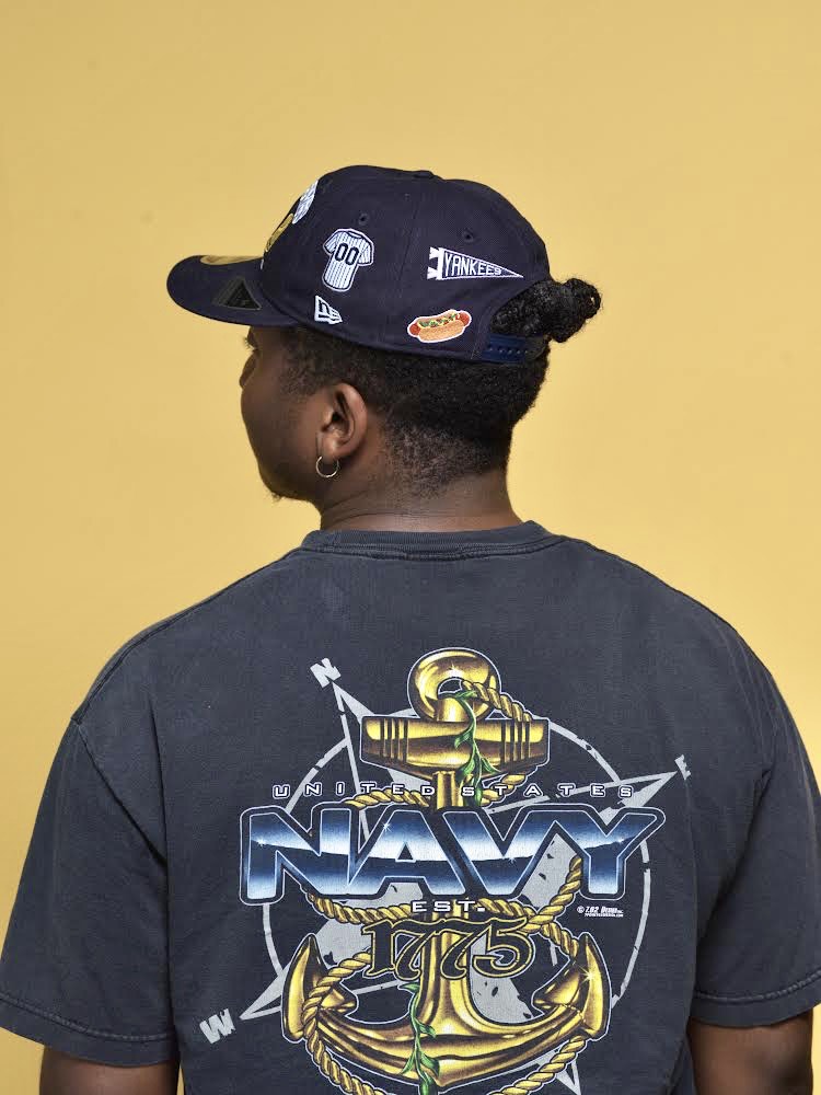
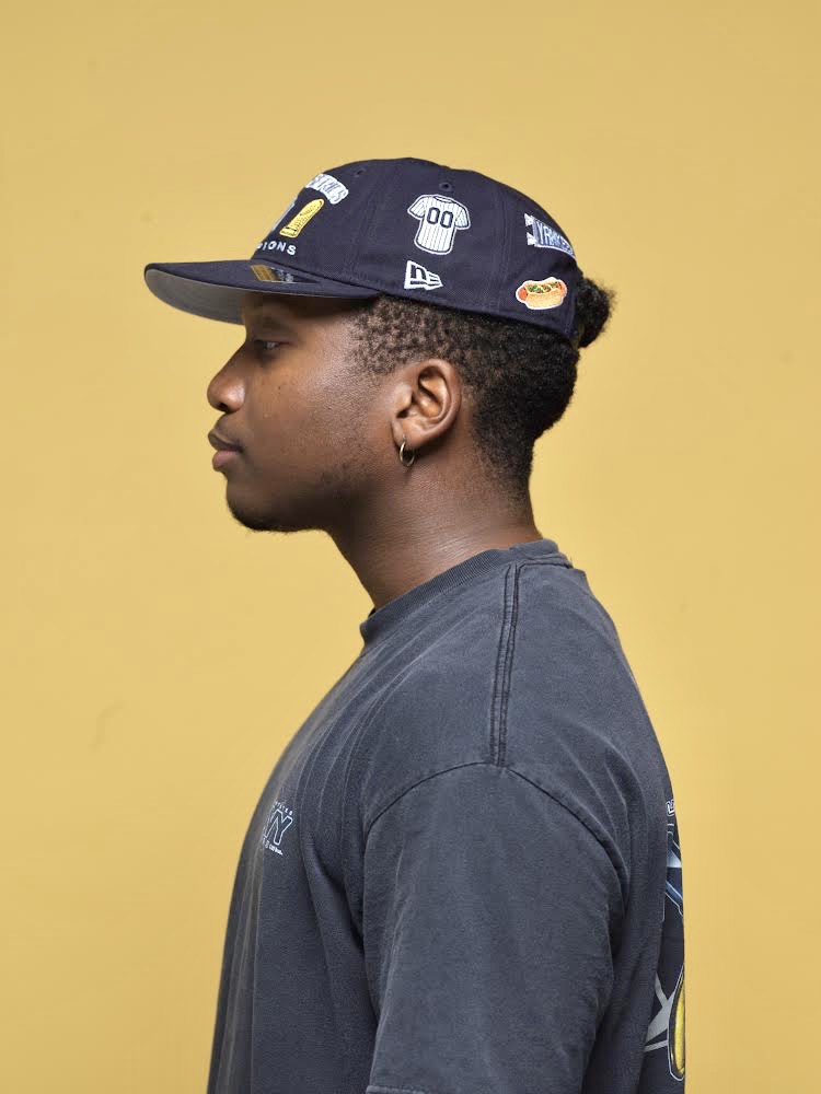
Here’s an example of an attempt at complimentary colors. The subject has on a darker blue/ grey washed shirt and hat with a yellow backdrop. They contrast each other well, yes, but they are not complimentary enough to create a bold focal point.

The example above is a true representation of complementary colors. The background is essentially yellow with a purple focal point. The colors compliment each other based on the color spectrum, thus evoking a bold and concise image to the viewer. The color saturation is well balanced, but much more saturated than the photos shown above which also gives the flower photo a more dynamic appeal.